

Class Ranked is building a community where students provide feedback to the professor and their classes. We need to develop an interface that entices students to use the app and participate by providing their input through taking the surveys.
Objective: To engage students to finish class surveys and raise participation.
Scope: The project will involve designing an interface that will entice students to complete the surveys and find incentives that will attract them.

My partner and I scheduled an interview with the stakeholder and asked additional questions to allow us to start our research baselines and conduct our “How Might We.”

For our research, we completed survey questions that we posted and got 13 responses. The crucial results we got were that, unfortunately, people rarely participate in surveys, and some of the reasons for that are that the surveys are too long, do not make any change, and people do not benefit from them. People also stated that they would like other students to be able to see their feedback about the course and professor. And their primary motivation to complete surveys is if they could see the improvement in teaching. Additionally, 69.2 % believe that class surveys are an efficient way to improve classes.

We interviewed 7 people who are current or recent graduates ages 24–35. We acquired that some students believe that surveys are helpful but must serve the student in their current course. Some reports from students we got were that they needed more motivation to complete the ‘End of term’ Surveys because the class was over and no longer affected them. The negative behaviors students observed are that the same professor with a bad reputation still teaches the same class, and students feel like the University does not care.

We researched Qualtrics and SmartEvals as potential competitors and gained insights for our evaluation software.
We prioritize user experience by using user-friendly interfaces and customizable survey templates like Qualtrics and SmartEvals.
Our product has predictive intelligence and text analytics, giving our users deep insights into their survey data. It sets us apart from competitors.
Specialize to stand out in the market by targeting a specific niche or industry. SmartEvals offers solutions catered for the education market, including course evaluation management, accreditation management, and faculty activity reporting.
Highlight using survey data for decision-making: The survey software market is growing due to the demand for data-driven decisions. Promote our product as a valuable tool for organizations by emphasizing the importance of using survey data to inform business decisions in marketing messaging.
Using mobile survey technology can meet customer demand for accessibility and convenience.

The main results of our empathy map were pains and gains. The pains were that universities didn’t care, students did not see changes recommended on the survey, and they got no benefits from accomplishing a survey. And the gains were that they hope to improve the course, they want their voice to be heard, and they want to see feedback and improvement.


We used two user personas to understand our users better since we had two categories of people in our interviews: one who was not excited about surveys and one who stated that surveys are valuable. Two personas would help us to bring more comprehensive research, improve decision-making, and increase empathy to create more successful products.


We've researched a student who values feedback but has yet to see improvement in their professor's teaching. By creating a user journey map and gathering feedback, we aimed to suggest ways to enhance the user experience for ClassRanked.

User flows are essential for digital products' success. They visually represent a user's journey, making communication between teams more manageable. By mapping out each step, we can identify pain points and areas for improvement. We presented 3 flows, including surveys and incentive redemption.

To build low-fi’s, we started by sketching rough ideas on paper and using digital tools. We focused on quickly iterating and refining these initial designs based on user research and our observations. These low-fi prototypes allowed us to test and refine ideas.

Once we sketched out low-fi’s, we created mid-fi prototypes. These prototypes allowed us to test more complex interactions and better understand how users would engage with the app. We quickly iterated on designs based on user feedback and refined our ideas before moving on to high-fidelity development.

After conducting color research, we found that green is associated with nature and the environment, which is relevant for sustainability, ecology, and outdoor education apps. However, blue is associated with trust, intelligence, and reliability, making it a better choice for educational apps. Blue also creates a calming and professional environment, improving user engagement and retention. We used lighter shades of blue for a friendlier feel and accented with reds, aqua, and some greens for vibrancy.

Our stakeholders provided an option for the typography, and we carefully considered several factors when using the typography for the app:
Readability: The primary goal of our app is to provide information to users, so it was essential to choose a typeface that is easy to read. We opted for Inter typeface that is legible on small screens and has a consistent weight across different font sizes.
Branding: Our app has a unique brand identity, and we had to ensure that the typography aligns with our brand guidelines.
Accessibility: We want our app accessible to all users, including those with visual impairments.

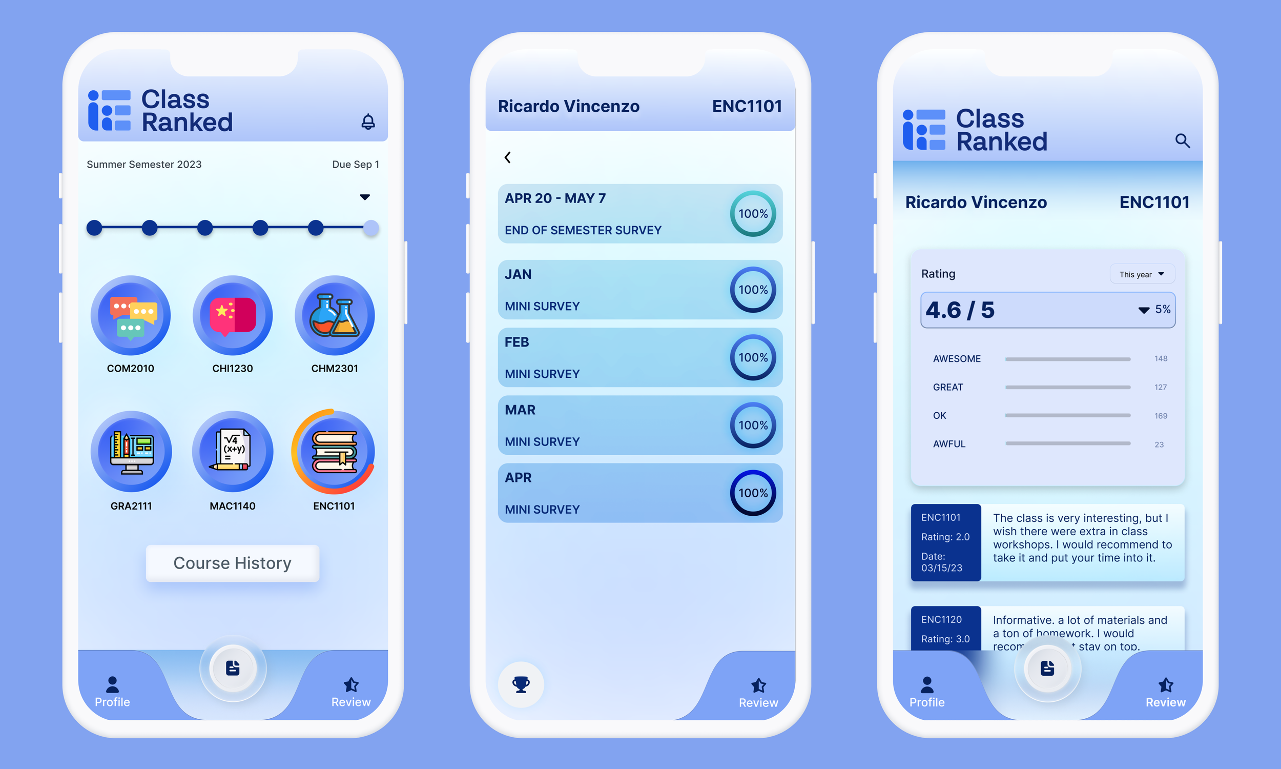
For our design system, I created a unique menu shape, and my partner encountered icons to bring fun to the students who go through the app and take surveys. We kept the company’s guidelines and branding, including blue as our primary color. Additionally, we incorporated a responsive design approach to ensure that the app’s layout and style adapted seamlessly to different screen sizes and devices. I worked on including animation in our design system, such as progress bars, statistics, etc.


After creating a prototype, it’s essential to test it to ensure that it meets the desired specifications and functions as intended. This is where tool testing comes into play. My partner and I sent our prototypes to UseBerry to complete user testing and see if the prototype needed more additional work and changes. Based on the low-fi and high-fi design system, we created prototypes representing three flows: Mini-Surveys, End of Semester Surveys, and Redeeming & Open Reviews.

During the user testing phase of our project, our team received mixed results for our prototype. While some users found the interface intuitive and easy to use, others needed help with specific design aspects. In particular, we received feedback that certain buttons and menu options must be clearly labeled, leading to confusion and frustration among some users. Additionally, several users reported difficulties navigating between different screens and understanding the overall flow of the application.
As a result of these findings, I had to continue on my own and make several significant revisions to the prototype, including re-labeling buttons and menu options, simplifying the overall navigation structure, and adding additional guidance and explanatory text throughout the application. I then conducted a second round of user testing with these changes implemented, resulting in significantly more positive user feedback.
Overall, while the initial user testing phase highlighted several critical areas for improvement in our prototype, I could use this feedback to make substantial changes that ultimately led to a more user-friendly and practical design.